


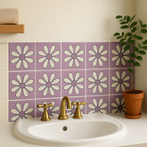
How Handmade Talavera Tiles Bring Color and Personality to Neutral Interiors
Neutral interiors offer calm, versatility, and visual continuity, but they can also feel impersonal when every surface has a similar color, texture, and finish. White walls, beige upholstery, natural stone, and pale wood create a strong foundation; what they sometimes lack is a focal element capable of giving the room a distinct identity.
Handmade Talavera tiles can provide that missing layer. Their painted patterns introduce color in a permanent architectural form rather than through temporary accessories alone. A carefully designed backsplash, fireplace surround, tiled niche, or staircase can enliven a neutral room while preserving its sense of balance.
The key is not to add as many colors or patterns as possible. Effective design depends on placement, proportion, and a clear relationship between the tile and its surroundings. Talavera tiles work especially well against restrained palettes because their variations in glaze, brushwork, and pigment remain visible. The neutral background gives the craftsmanship room to be appreciated.
Understanding how to select and position handmade tile makes it possible to create an interior that feels colorful but composed, expressive but not excessive, and personal without sacrificing long-term versatility.
Why Neutral Interiors Benefit from Handcrafted Color
Neutral rooms depend heavily on subtle differences. Without strong color contrast, the design must create interest through proportion, material, light, and texture. Linen, wool, plaster, limestone, oak, and handmade ceramics can all belong to a neutral palette, yet each reflects light and ages differently.
Problems arise when the palette is neutral and the surfaces are also visually uniform. Smooth white walls, flat cabinet fronts, polished counters, and solid-color flooring may produce a clean result, but they do not always create a memorable one. The room can appear complete in a technical sense while lacking personality.
Handmade Talavera tile introduces several forms of contrast simultaneously. It adds color, pattern, gloss, visible brushwork, and slight surface variation. Because these qualities are concentrated in an architectural feature, the room gains character without needing unrelated decorative objects on every surface.
Tile also gives color a sense of permanence. Cushions and artwork can be changed easily, but a tiled feature appears integrated into the architecture. This makes it especially important to select a palette and pattern that have a meaningful relationship with the home rather than following a short-lived trend.
What Makes Handmade Talavera Tile Distinctive?
Talavera is associated with a historic glazed-earthenware tradition that developed in Mexico through the interaction of European ceramic methods, Islamic decorative influence, and Indigenous knowledge of clay and pigments. The visual language includes floral motifs, scrolling forms, geometric patterns, borders, and figurative designs.
The broader market also uses the term “Talavera tile” for Mexican hand-painted decorative tiles inspired by this tradition. Production methods and provenance can vary, so buyers should understand whether they are considering formally certified Talavera ceramics or Talavera-style handmade tiles.
What distinguishes handmade tile from mechanically printed alternatives is the visible role of the artisan. Painted lines may differ slightly in width. Pigments may be more concentrated in one area than another. The glaze can settle differently along an edge or around a brushstroke. These controlled irregularities allow individual pieces to remain part of a unified composition without looking identical.
Against a neutral wall, these differences become an advantage. The surrounding simplicity directs attention toward the details of the tile: the movement of a painted line, the depth of blue pigment, or the subtle shift between a creamy glazed background and a warmer clay edge.
Using Color Without Overwhelming the Room
Introducing Talavera tile into a neutral interior does not require abandoning restraint. Color can be strong while remaining limited in area. A small installation with clear visual purpose often has greater impact than pattern applied indiscriminately.
Begin by deciding how the tile should function. It may be the room’s primary focal point, a visual bridge between several materials, or a smaller accent that rewards closer attention. This decision determines the appropriate pattern scale, color intensity, and installation area.
If the tile will be the main focal point, it can support a richer palette and more detailed motif. Surrounding walls, cabinetry, and furnishings should remain comparatively quiet. If the room already contains prominent artwork, veined stone, or strong architectural details, choose Talavera tiles with a narrower color range or use them in a smaller area.
Repeated color creates cohesion. A cobalt accent in the tile might reappear in a ceramic vessel or framed textile. Warm yellow could be reflected in brass hardware, while green might connect to plants or a view of the garden. These repetitions should be subtle. Exact matching can make the design feel overly coordinated, while related tones create a more natural composition.
Choosing Talavera Colors for a Neutral Palette
The term “neutral” includes more than white and beige. Neutral palettes may lean warm, cool, earthy, or gray. Identifying the undertone of the room helps determine which Talavera colors will feel integrated.
Warm White, Cream, and Beige
Warm neutrals pair naturally with cobalt blue, golden yellow, terracotta, olive green, and deep brown. These colors create contrast without making the room feel visually disconnected. A creamy tile background can also relate more comfortably to warm plaster and limestone than a bright, cool white.
For a Spanish, Mediterranean, or Hacienda influence, combine warm walls with multicolor floral or geometric tiles. Dark wood, aged brass, copper, and wrought iron can support the palette while adding depth.
Cool White and Soft Gray
Cooler interiors benefit from blue-and-white Talavera patterns, especially designs dominated by cobalt or softer blue tones. These tiles can enliven gray cabinets, marble surfaces, brushed metal, and pale flooring while preserving a crisp atmosphere.
If the room feels too cold, introduce a small amount of warm pigment through yellow, rust, or green details. Natural wood can also soften the transition between the colorful tile and a cool architectural palette.
Earth-Toned Neutrals
Clay, sand, mushroom, taupe, and muted brown interiors pair well with green, ochre, dark blue, and reddish-orange motifs. Earth-toned rooms can accommodate more complex patterns because the surrounding colors already have a natural relationship with traditional ceramic pigments.
Unglazed terracotta, textured plaster, and woven fibers reinforce the material character of handmade tile. The result can feel layered and substantial without depending on high contrast.
Black-and-White Interiors
A black-and-white room offers a strong graphic foundation. Talavera tile can either continue that discipline with blue-and-white geometry or disrupt it intentionally with a multicolor focal panel.
Because black-and-white interiors already contain pronounced contrast, decorative tile should be placed carefully. A contained feature—such as a range backsplash, vanity wall, or fireplace insert—usually feels more deliberate than several competing patterned areas.
Creating a Kitchen Focal Point
Kitchens often contain large expanses of hard, neutral surfaces. Cabinetry, countertops, flooring, and appliances may all be selected for durability and versatility, leaving the backsplash as the best opportunity for color and ornament.
A full Talavera backsplash can transform white or cream cabinets without requiring changes to the rest of the kitchen. Repeating geometric patterns create rhythm, while floral designs produce a softer and more traditional impression. Blue-and-white tile works well in restrained kitchens; multicolor patterns can bring warmth to rooms dominated by gray or pale stone.
For a more controlled composition, install decorative Talavera tiles behind the range and use solid-color tile throughout the remaining backsplash. A border can frame the patterned area, turning it into an architectural panel. This approach concentrates the visual interest where it can be seen clearly.
Another option is a curated mix of related patterns. This produces a collected appearance suited to Spanish Colonial and Hacienda-inspired kitchens. The tiles should share a common palette or background color so the installation reads as varied but intentional.
Before installation, lay the tiles on a flat surface and review the distribution. Avoid accidental clusters of the same pattern or color. Consider the location of electrical outlets and cabinet edges so important motifs are not interrupted unnecessarily.
Adding Character to a Neutral Bathroom
Neutral bathrooms are practical and often visually restful, but an uninterrupted combination of white tile, pale stone, and simple fixtures may feel closer to a showroom than a personal space. Talavera tiles can introduce identity without compromising the room’s functional requirements.
A vanity backsplash is an effective place to begin. It requires a relatively small quantity of tile and keeps the decoration near eye level. The tile can extend from the counter to the mirror, frame the mirror, or cover the entire vanity wall.
Decorative niches offer another controlled application. A patterned back panel inside a shower niche creates a small moment of color surrounded by neutral field tile. The pattern should be selected with the niche dimensions in mind; a large motif may be lost if it must be cut into several fragments.
Talavera tile can also form a wall border or wainscot. In a powder room, where the installation is less exposed to continuous moisture, a more detailed pattern can create a memorable environment. Full bathrooms require confirmation that the tile and installation materials are suitable for the intended wet area.
Decorative wall tile should not automatically be used on a shower floor. Floors need appropriate durability, water performance, and slip resistance. A compatible floor tile can support the Talavera palette while meeting the technical requirements of the space.
Transforming a Fireplace into an Architectural Feature
A neutral living room often needs a visual anchor. The fireplace is a natural candidate because it already occupies a central position and provides a defined surface for tile.
Talavera tiles can cover the entire surround, create a decorative inset, or form a narrow border around the firebox. In a minimalist room, a simple blue-and-white pattern introduces detail without weakening the clean architecture. In a warmer interior, multicolor tile can connect wood furniture, natural textiles, and aged metal finishes.
The mantel influences how the installation is perceived. A plain plaster mantel allows the tile to become the primary ornament. Reclaimed wood adds rustic warmth, while carved stone supports a more formal Spanish or Mediterranean appearance.
Fireplace applications require technical planning. The tile body, substrate, setting material, and grout must be appropriate for the temperatures and construction conditions involved. Applicable clearances and building requirements should be reviewed by an experienced installer.
Using Talavera Tiles on Stair Risers
Stair risers offer one of the most expressive ways to introduce Talavera tile into a neutral home. Each riser acts as a horizontal decorative panel, allowing the pattern to be viewed as people move through the space.
A single repeated design creates consistency and works well in more formal interiors. Alternating several coordinating patterns produces a lively, collected effect. To keep a mixed arrangement cohesive, maintain a shared background color or repeat a limited group of pigments.
The stair treads should remain visually quieter than the risers. Wood, stone, or simple solid-color tile provides contrast and allows the patterns to remain legible. The selected tread material must also address traction and wear.
Pattern sequence should be planned before installation. Place all tiles in order and photograph the layout for reference. This helps prevent two similar patterns from meeting accidentally and ensures strong colors are distributed throughout the staircase.
Smaller Applications with Significant Impact
A room does not need a large tile installation to benefit from Talavera craftsmanship. Small architectural accents can introduce color with precision and are especially useful for homeowners who want to preserve a predominantly neutral palette.
A tiled niche in an entry hall can frame a vase, sculpture, or religious object. The back of a built-in bookcase can feature a limited band of patterned tile. A kitchen island may use Talavera tile on the side facing a dining area, leaving the main work surfaces neutral.
Other possibilities include window surrounds, door borders, bar fronts, planter boxes, wall medallions, and the face of a built-in bench. Because these features occupy limited areas, they can support intricate designs without controlling the entire room.
Small applications also make handcrafted tile accessible within different project budgets. Rather than selecting an inexpensive imitation for a large wall, it may be more rewarding to use authentic handmade tile in a smaller, better-positioned feature.
Balancing Pattern with Furniture and Textiles
Patterned tile becomes part of the room’s long-term architecture, so movable furnishings should support it rather than compete with it. Solid or subtly textured upholstery provides a quiet counterpoint to detailed Talavera motifs.
If patterned textiles are included, vary their scale. A large, loosely woven stripe can coexist with a small floral tile because the patterns operate differently. Two intricate motifs of similar scale may compete, particularly if both contain several strong colors.
Natural materials help mediate between colorful tile and a neutral room. Wood introduces warmth, leather provides depth, linen softens reflective glaze, and woven fibers add texture without additional color. Plants can repeat green pigments while bringing organic form into a geometric installation.
Artwork should be evaluated from the same sightline as the tile. A large, colorful painting directly beside a complex backsplash or fireplace can create unnecessary competition. Moving the artwork to another wall may allow both elements to retain their importance.
How Light Changes the Appearance of Talavera Tile
Glazed tile responds actively to light. Daylight reveals pigment variation and makes glossy surfaces appear brighter, while evening illumination can deepen the colors and emphasize the warmth of the glaze.
Directional lighting may produce highlights on slight surface irregularities. This is often desirable because it reveals the handmade character of the tile. Strong glare, however, can obscure a pattern when viewed from certain angles.
Evaluate samples vertically in the room where they will be installed. A tile placed flat on a table does not receive light in the same way as a backsplash or fireplace surround. Observe it at several times of day and under the fixtures that will be used at night.
Light also affects the surrounding neutral colors. A warm white wall may appear creamier near yellow and terracotta tile, while cobalt blue can make a pale gray surface seem cooler. Reviewing the complete material palette under actual lighting helps prevent unexpected color shifts.
Selecting the Right Pattern Scale
Pattern scale should relate to the dimensions of the installation and the distance from which it will usually be viewed. A detailed individual motif can be appreciated on a vanity backsplash or stair riser. Across a large wall, a broader repeat may create stronger visual order.
Consider how cuts will affect the pattern. A tile with an important central medallion may look incomplete if it must be trimmed around multiple outlets or corners. Smaller repeating designs are often easier to adapt to complicated backsplash layouts.
Borders can help resolve changes in material and define the limits of a pattern. They are useful around murals, fireplaces, niches, and range panels. Corner and trim pieces should be planned at the same time as field tiles rather than treated as an afterthought.
A scaled drawing or physical dry layout makes pattern decisions easier. It reveals whether the composition feels appropriately proportioned before any tile is permanently installed.
Installation Considerations for Handmade Tile
Handmade tiles may vary slightly in dimensions, thickness, edge profile, color, and glaze coverage. These differences require an installer who understands how to create an orderly composition without forcing every joint into mechanical uniformity.
Order enough material to account for cuts, selection, accidental damage, and future repairs. The required overage depends on the layout. Diagonal installations, complex borders, small niches, and patterns with a fixed orientation usually require more material than straightforward rectangular fields.
Ordering the complete quantity at one time helps maintain color continuity. Tiles produced in a later batch may show noticeable glaze or pigment differences. Those differences can be attractive within a planned installation but difficult to integrate after the work is finished.
Before setting the tile, open multiple boxes and distribute the natural variation across the surface. Confirm the direction of every pattern and identify pieces intended for prominent positions. Handmade tile should be composed, not installed randomly without review.
Grout color also deserves careful attention. A color close to the tile’s background creates a unified appearance. Contrasting grout emphasizes the grid and may make an intricate pattern feel busier. Test grout beside the physical tile before making the final choice.
Why Craftsmanship Matters in a Neutral Interior
Neutral design places materials under close scrutiny. When color is limited, differences in quality, texture, and finish become easier to see. This is why handmade Talavera tile can have such a strong presence in an otherwise restrained room.
The production process involves preparing and forming clay, controlling drying, completing an initial firing, applying glaze, painting the design, and firing the decorated tile again. Each stage affects the appearance and performance of the finished piece.
Experienced artisans understand how pigments respond to heat, how glaze settles on the ceramic surface, and how much variation a repeated pattern can support without losing visual unity. Their knowledge is present in the finished installation, even if the viewer does not immediately recognize every technical decision.
This craftsmanship gives the room more than decoration. It introduces evidence of process and human skill. A neutral interior can then remain calm while gaining the depth and individuality often missing from mass-produced surfaces.
Explore Handmade Talavera Tiles for Your Interior
The most successful Talavera installations begin with a clear understanding of the room. Consider the existing neutral palette, permanent materials, available light, viewing distance, and architectural features before selecting a pattern.
Explore handmade Mexican tile designs, borders, solid colors, and decorative options at Mexican Tile Store. Comparing several patterns can help determine whether the project needs a bold focal point, a restrained blue-and-white composition, or a smaller handcrafted accent.
For assistance with product selection, quantities, coordinating pieces, or the technical needs of a specific application, contact Mexican Tile Store. Discussing the project before ordering can help ensure the tile is appropriate for its location and that all necessary components are included.
Conclusion
Neutral interiors do not need excessive decoration to feel personal. They need carefully selected materials that offer contrast, craftsmanship, and a meaningful visual presence. Handmade Talavera tile can provide all three.
Its color gives energy to pale walls and quiet cabinetry. Its patterns introduce rhythm and cultural character. Its glaze reflects light, while natural differences in brushwork and tone keep the installation from appearing mechanical. Because these qualities are built into an architectural surface, they become part of the room rather than an accessory placed within it.
Restraint remains essential. A thoughtfully positioned backsplash, fireplace surround, tiled niche, or staircase can be more effective than covering several unrelated surfaces. The surrounding neutral palette should frame the craftsmanship and allow the pattern to remain legible.
By selecting colors that complement the room’s undertones, matching pattern scale to the installation, and planning the layout carefully, homeowners and designers can use Talavera tiles without sacrificing calm or versatility. The finished interior remains refined and balanced, but it also gains something a purely neutral palette cannot always supply: a recognizable personality shaped by color, material, and the hand of the artisan.