


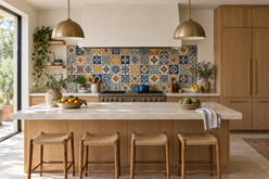
How Mexican Pattern Tiles Create a Handcrafted Focal Point in Modern Kitchens
Modern kitchens often rely on uninterrupted cabinetry, simple hardware, and restrained material palettes. These choices create clarity, but a room built entirely around smooth, uniform surfaces can feel visually predictable. Mexican pattern tiles introduce a different kind of detail: painted motifs, expressive color, and the subtle variations associated with handmade ceramics. Used thoughtfully, they give the kitchen a focal point while preserving the clean composition that makes modern design appealing.
The strongest results depend on more than selecting an attractive tile. Pattern scale, placement, surrounding materials, and the relationship between individual pieces all influence how the finished surface reads. A carefully composed backsplash can connect wood cabinetry with a pale countertop, while a concentrated range wall can give an open kitchen a recognizable center. Understanding these relationships helps homeowners and designers incorporate handcrafted character with intention. The goal is a kitchen where decorative tile contributes structure, warmth, and visual interest without making every surface compete for attention.
Why Mexican Pattern Tiles Work in Modern Kitchens
Modern design provides a useful framework for decorative tile because its simpler surfaces make individual details easier to appreciate. Flat cabinet fronts establish broad planes, straight countertop edges create clear boundaries, and restrained hardware limits visual interruptions. Against that background, a painted ceramic pattern becomes legible.
The contrast also operates at a smaller scale. Repeated cabinetry modules create architectural order, while variations in brushwork and color intensity introduce a human presence. The room can feel composed without appearing completely uniform.
This relationship does not require a fully rustic or traditional kitchen. A floral motif can sit comfortably beside streamlined cabinetry when the palette and placement are controlled. Conversely, geometric Mexican tiles can reinforce the kitchen’s existing lines while bringing a more expressive surface to the composition.
Choose a Focal Point That Follows the Architecture
Start by identifying where the eye naturally lands when entering the kitchen. In one layout, that might be the range and hood; in another, it may be a sink beneath a window or a backsplash visible from the dining area. Place the strongest pattern where it supports that existing organization.
A range wall offers an identifiable center, especially when the cabinetry on either side feels balanced. Patterned tile can strengthen that arrangement, but its boundaries should relate to the hood, cabinet edges, or another clear architectural feature. An arbitrary stopping point can make the installation appear disconnected.
A continuous backsplash creates a different effect. Instead of emphasizing one vertical feature, it links preparation areas and establishes a horizontal rhythm. This approach can suit a compact kitchen with several interrupted wall sections.
In an open plan, assess the tile from adjoining spaces. A backsplash that feels balanced at the countertop may become surprisingly prominent from the living room. Keep the main sightline in mind before deciding how much wall to cover.
Use Pattern Scale to Control Visual Intensity
Tile dimensions and pattern scale are related, but they are not the same. A small tile may contain a dense, intricate motif, while several tiles may join to form one larger design. Evaluate the complete repeat rather than judging a single piece in isolation.
Larger motifs need enough uninterrupted surface to be understood. If a backsplash is broken by numerous outlets, windows, and cabinet changes, important parts of the design may disappear into cuts. Smaller repeats can be easier to distribute across those interruptions, although closely packed details may look busier.
Viewing distance matters as well. Fine brushwork rewards attention nearby, while strong shapes remain visible from across an open kitchen. Arrange several actual tiles together and look at them from both positions. This reveals whether the composition reads as a distinct pattern, a broad color field, or a more active patchwork.
Build a Color Palette Around Mexican Pattern Tiles
Choose which tile color will connect with the surrounding kitchen and which will provide contrast. This distinction helps prevent every color in a multicolored pattern from becoming a separate decorating assignment.
Blue-and-white Mexican tiles offer a relatively focused starting point. White areas can relate to light cabinetry or countertops, while cobalt outlines give the backsplash definition. Against natural wood, the cooler blue creates contrast with warmer grain, making both materials easier to distinguish.
Multicolored tiles require a little more editing. A pattern containing green, yellow, terracotta, and blue can still feel coherent if the room repeats only one or two of those tones. For example, wood cabinetry may connect with terracotta accents, while a muted green cabinet finish picks up a secondary painted detail.
Check the background color carefully. A warm ceramic white beside a cooler countertop white can make their difference more noticeable. Evaluate actual samples together under daylight and the kitchen’s planned lighting before treating them as a match.
Decide Between One Repeating Pattern and a Mix
Repeating one design produces a predictable visual rhythm. In a modern kitchen, that rhythm can connect decorative craftsmanship with the ordered lines of cabinetry. Consistent orientation is especially important when adjoining tiles complete a larger motif.
Mixing several patterns creates a more collected appearance. The composition becomes less about one repeated symbol and more about relationships between colors, shapes, and areas of detail. A shared background color or a limited family of blues and greens can hold the mixture together.
For a balanced arrangement, lay out the selection before installation. Spread darker pieces across the field instead of allowing them to form an unintended cluster. Alternate visually dense patterns with quieter ones where the selection allows.
Neither approach is inherently more appropriate for modern design. A repeated multicolored motif may feel more orderly than an unplanned mix of blue-and-white tiles. The overall arrangement matters as much as the number of colors.
Give Surrounding Materials a Clear Supporting Role
Natural wood provides an organic counterpoint to painted geometry. Its grain moves differently from a repeating tile motif, creating contrast without necessarily introducing another strong color. Relatively quiet grain can be especially useful beside intricate patterns; highly figured wood deserves the same visual consideration as boldly veined stone.
Stone countertops can anchor the composition through broad, calmer areas. If the stone already has dramatic veining, consider a tile pattern with fewer colors or a smaller installation area. Both surfaces need enough visual space for their individual character to remain understandable.
Plaster or a softly textured painted wall can offer a pause beside decorative ceramics. That quieter area helps define the tile’s importance rather than extending visual activity across the entire room.
Metals contribute through smaller accents. Copper brings warm reddish tones that contrast with cobalt and relate to terracotta. Brass can echo yellow details, while a bronze-inspired finish or restrained black iron element introduces darker definition. Repeat a finish selectively so hardware and lighting support the tile without becoming another competing feature.
Let Handmade Character Remain Visible
Handmade Mexican Talavera-style ceramic production may involve preparing clay, forming individual pieces, drying, an initial kiln firing, hand painting with pigments, glazing, and a final firing. Processes vary by workshop, so this should be understood as a general description rather than a specification for every tile.
The finished pieces may differ in dimensions, thickness, brushwork, pattern placement, color intensity, glaze, and surface character. These differences help distinguish artisan ceramics from industrially calibrated products.
In a modern setting, this variation can be especially noticeable because neighboring materials are often more uniform. Allow it to be part of the design instead of expecting every painted line or tile edge to align with machine-made precision.
That does not mean accepting damage or overlooking installation concerns. Review the delivered material with the installer, distinguishing normal artisan variation from issues that need clarification before work begins.
Plan the Layout With the Actual Tiles
A drawing establishes the concept, but the actual tile helps resolve the installation. Before fixing pieces in place, review the layout with an installer familiar with handmade ceramics. Natural dimensional differences need to be accommodated rather than forced into an unsuitable grid.
Identify the most visible centerline, then examine what happens at both ends of the surface. A centered motif may look convincing behind the range but leave awkward fragments beside a window. Adjusting the starting point can improve the overall balance.
- Check how the pattern meets cabinet undersides, countertops, corners, and exposed edges.
- Consider outlet locations before committing to a prominent central motif.
- Review borders and transitions so they finish the composition intentionally.
- Confirm how shelves, hood components, and other fixtures intersect the tiled area.
For sink areas and heat-adjacent installations, verify the tile’s suitability and the required substrate, waterproofing where applicable, adhesive, grout, and installation method. Appliance clearances and manufacturer instructions must also be checked. Decorative ceramic appearance alone does not establish suitability for every kitchen location.
Treat Grout and Lighting as Part of the Design
Grout affects whether the eye reads individual tile outlines or a more continuous patterned surface. A color close to the tile background can soften the grid. A contrasting shade emphasizes each piece and may compete with painted details if the pattern is already intricate.
Joint width is also a technical decision. It should reflect the actual material and installation requirements, including dimensional variation, rather than a photograph alone. Ask the installer to review a small sample arrangement before the final choice.
Lighting changes the appearance of color and glaze. Under-cabinet lighting can reveal surface variation and reflections that are less apparent in daylight. Test the tile and grout sample under the intended light, especially where a glossy surface sits close to a concentrated light source.
Keep the Focal Point Practical for Daily Use
Maintenance should suit both the ceramic surface and the installation materials. For routine cleaning, use mild soap, warm water, and a soft cloth or nonabrasive sponge, following any product-specific guidance. Avoid abrasive tools, abrasive powders, and unnecessarily aggressive chemicals.
Grout requires separate attention because its care requirements may differ from those of glazed tile. Confirm appropriate cleaning and any maintenance recommendations for the grout actually used.
Keep the countertop arrangement considered as well. A few regularly used objects can sit comfortably in front of a patterned backsplash, but excessive countertop clutter makes the design harder to read. Leaving some visible tile between appliances preserves the focal point during everyday use.
Create a Kitchen With Lasting Handcrafted Character
Mexican pattern tiles bring the most value to a modern kitchen when their placement, scale, and color relationships work together. A clear focal area gives the pattern purpose; quieter supporting materials give it room to be appreciated. Careful layout and appropriate installation then translate that visual idea into a usable kitchen surface.
The handmade qualities are central to the result. Variations in brushwork, glaze, and individual pieces introduce character within the kitchen’s clean architectural framework. By planning for those differences, the finished room can express both contemporary order and Mexican craftsmanship.
Visit Mexican Tile Store for inspiration, or contact the team with questions about tile for your kitchen project. Begin with the intended focal point and surrounding materials so your selection follows a clear design direction.